
UI UX design is the discipline that determines whether a digital product actually works for the people using it - whether someone buys, signs up, stays, or leaves. This guide is written for business owners and startup founders who need to make smart decisions about design without necessarily being designers themselves. Businesses looking for end-to-end UI UX design services as part of a complete software or mobile app development project can also explore the solutions offered by SpaceToTech. It covers what UI and UX actually are, how the design process works, what it costs, and what to look for when hiring.
Key Takeaways:
- UI design is how a product looks. UX design is how it works. You need both.
- Good design directly affects conversion rates, retention, and development cost.
- A typical business design engagement runs $3,000 to $50,000+ depending on scope.
- The design process runs in stages - skipping research almost always costs more later.
- AI is changing how fast design happens, but not what makes design good.
What Is UI UX Design?
UI UX design is the combined practice of designing how a digital product looks (user interface design) and how it functions from a user's perspective (user experience design). Businesses evaluating professional UI UX design solutions should look beyond visual aesthetics and focus on research, usability, accessibility, and measurable business outcomes. The two disciplines are almost always discussed together because they're deeply interdependent - but they involve different skills, different deliverables, and different ways of thinking about a product.
What Is UI Design?
UI design (user interface design) is the visual and interactive layer of a digital product - everything the user sees and directly touches. A UI designer works on layout, typography, colour systems, button styles, icon design, spacing, and visual consistency across screens. Their job is to make the product look intentional, on-brand, and easy to scan.
What Is UX Design?
UX design (user experience design) is the structural and strategic layer. A UX designer works on user research, information architecture, user flows, content hierarchy, and usability - the logic of how a product is organised and how it feels to move through it. Where a UI designer makes things look right, a UX designer makes sure the right things exist in the right order.
How UI and UX Work Together
A product can have beautiful UI and still frustrate users - if the flow is confusing, the hierarchy is wrong, or key actions are buried. A product can have sound UX and still feel untrustworthy or unfinished if the visual layer is weak. The two disciplines reinforce each other, which is why they're typically handled together, either by a designer who spans both or by a team where the two roles work closely in parallel.
UI vs UX Design - What's the Difference?
UI vs UX is one of the most Googled questions in this space, and the confusion is understandable - the terms are used interchangeably in job titles, agency descriptions, and project briefs all the time. The difference between UI vs UX is real and practically important when you're scoping a project or hiring.
UI vs UX Comparison Table
| UI Design | UX Design | |
| Focus | Visual appearance and interactive elements | User flow, structure, and overall experience |
| Deliverables | Style guides, design systems, final screen designs | User personas, wireframes, user journey maps |
| Common Tools | Figma, Adobe XD, Sketch | Figma, Miro, Maze, UserTesting |
| Real-World Example | Designing the checkout button - size, colour, position | Deciding where in the flow the checkout button appears and what happens after it's clicked |
A Simple Way to Remember the Difference
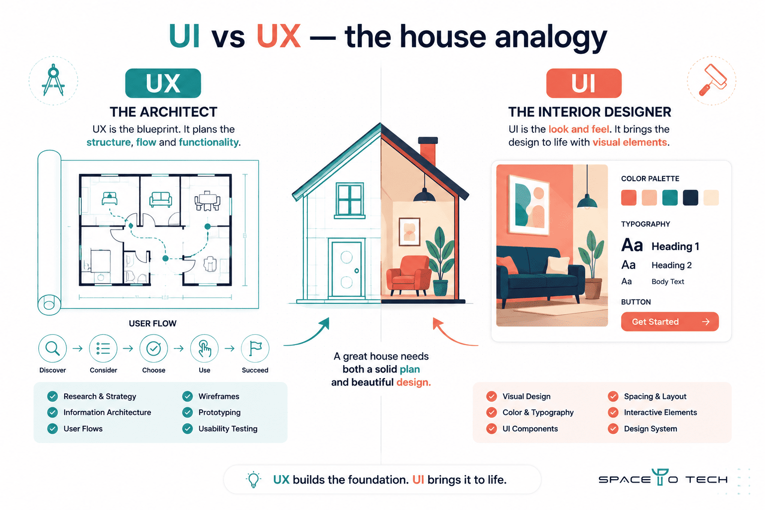
Think of a house: UX is the architect's floor plan - where rooms go, how you move between them, what each space is for. UI is the interior designer's work - what it looks like when you're inside it. Both matter. Neither works properly without the other.
Why Is UI UX Design Important for Businesses?
Good UI UX design isn't a polish exercise. It's an investment that affects whether your product makes money and whether users come back.
Impact on Conversion and Revenue
Design directly determines whether a visitor takes the action you want them to take. A poorly structured landing page with unclear hierarchy bleeds conversion. A checkout flow with unnecessary friction loses sales at the final step. Even small improvements - a clearer CTA, a shorter form, better visual feedback on error states - can meaningfully shift the numbers in a product that already has traffic.
The Business Case (ROI)
The return on investment case for UX is real and well-documented. Forrester Research has reported that every dollar invested in UX can return up to $100 - a 9,900% ROI - though that figure represents an upper-bound outcome from their research, not a guaranteed baseline. What's consistently true is the directional finding: design investment reduces post-launch rework, increases task completion rates, and improves retention, all of which affect revenue.
Why It Matters Especially for Startups
Startups have the least room for wasted development cycles. Building features before validating them through research and usability testing is how early-stage products burn runway on things users never needed. Beyond product risk, first impressions with investors and early users are almost entirely shaped by design - a product that looks unfinished or feels confusing signals immaturity regardless of the quality of the engineering underneath it.
The single most important design decision a startup can make early: spend time on UX research before visual design. The order matters more than most founders expect.
The Complete UI UX Design Process
The UI UX design process runs in stages that build on each other. Skipping or compressing early stages doesn't save time - it moves the cost of mistakes downstream, where fixing them is significantly more expensive.
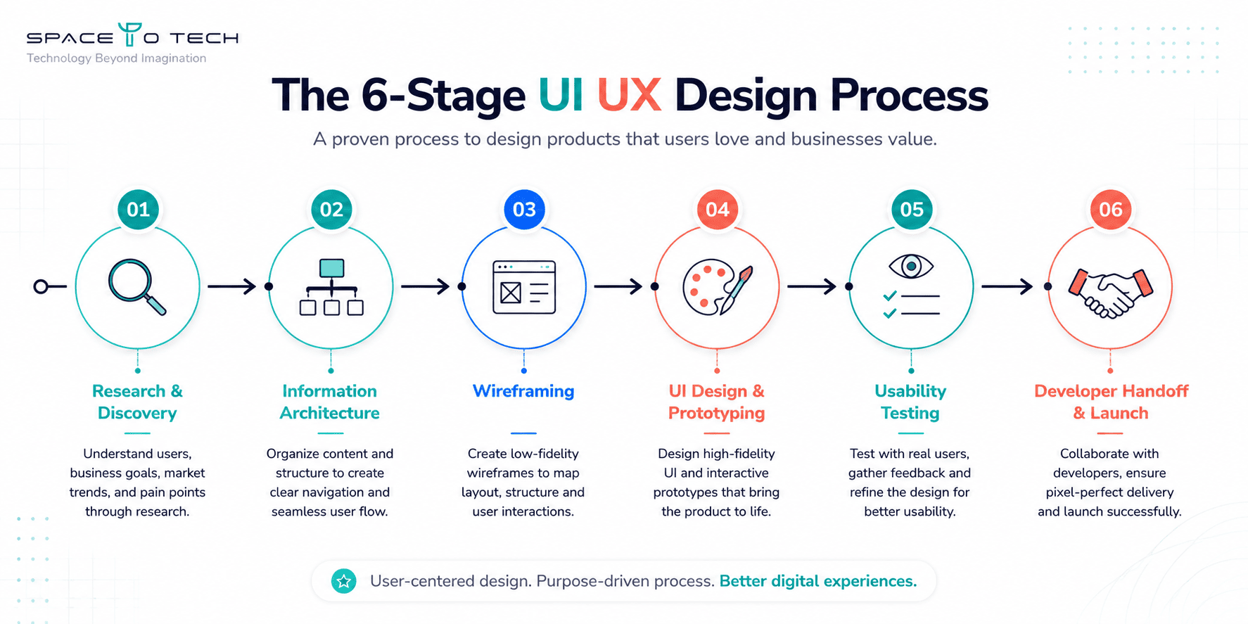
1. Research & Discovery
Every design process should start with understanding the user, not the interface. This stage covers user research (interviews, surveys, contextual observation), competitor analysis to understand what patterns already exist in the market, user persona development to represent the real people using the product, and empathy mapping to understand what users feel, think, say, and do across a given task.
In our client projects at SpaceToTech, we typically find that the assumptions clients come in with about their users are accurate roughly 60–70% of the time. The 30–40% that's wrong tends to be concentrated in exactly the areas where the product later struggles.
2. Information Architecture & User Flows
Information architecture is the structural backbone of a product - how content and features are categorised, labelled, and connected. This stage produces sitemaps, navigation structures, and content hierarchies. It also covers user flow mapping: charting every path a user can take through the product to complete a task, including the paths that go wrong.
Getting this right before moving to visual design prevents one of the most expensive problems in product design - building a beautiful interface around a fundamentally confused structure.
3. Wireframing
A wireframe is a low-fidelity structural layout of a screen - boxes, labels, and rough placement with no colour, typography, or visual design applied. Wireframes exist to test structure and flow before any visual investment is made. Changing a wireframe takes minutes. Changing a finished design takes hours. Changing something already in development can take days and cost significantly more.
The point of a wireframe is to catch structural problems cheaply. Any team skipping wireframes because "we'll figure it out in design" is moving the problem, not eliminating it.
4. UI Design & Prototyping
This is where the product gets its visual identity - colour system, typography, component design, spacing rules, and interactive states. Visual design happens in tools like Figma, Adobe XD, or Sketch. The output of this stage is typically a set of high-fidelity screen designs and an interactive prototype - a clickable simulation of the product that looks and behaves close to the real thing, without requiring any engineering work to produce.
A design system is often produced alongside the UI designs for products that will continue growing - a library of reusable components, documented rules, and design tokens that keeps the product visually consistent as new screens are added over time.
5. Usability Testing
Usability testing means putting real users in front of the product (or the prototype) and watching what happens. Where do they hesitate? What do they misread? Which actions do they take that you didn't expect? This stage often includes A/B testing for specific design decisions, heatmaps and session recordings to understand real-world usage patterns, and structured task-completion testing with a defined set of users.
Teams that skip usability testing before launch ship problems they could have caught for a fraction of the cost of fixing them after release.
6. Developer Handoff & Launch
A clean developer handoff is the difference between a design that ships as intended and one that degrades through implementation. A proper handoff includes annotated designs with spacing, state documentation (default, hover, active, error, empty states), asset exports, a style guide or design system reference, and direct communication between designers and developers to resolve interpretation questions before they become bugs.
Tools like Figma's developer mode, Zeplin, and Storybook support the handoff process - but the most important part is a designer being available during early development to answer questions in real time.
The Psychology Behind Good UI UX Design
Good design isn't arbitrary - it's grounded in how human cognition actually works. Understanding a few key principles is the difference between design that feels effortless and design that makes users think harder than they should.
Hick's Law
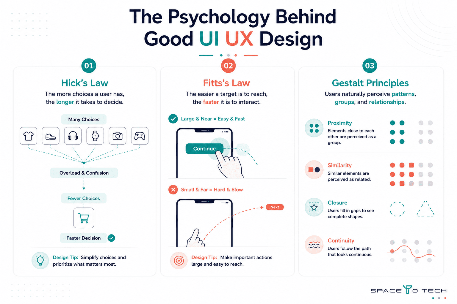
Hick's Law states that the time it takes to make a decision increases with the number and complexity of choices available. More options slow users down and increase abandonment. The practical application: navigation menus with 3–5 items outperform menus with 10–12, and checkout flows with fewer form fields convert better than ones that ask for everything upfront.
Fitts's Law
Fitts's Law describes how target size and distance affect interaction speed and accuracy. Larger, closer targets are faster and less error-prone to interact with. This is why primary action buttons are large and placed within easy thumb reach on mobile, and why small touch targets in navigation consistently frustrate users on phones with larger screens.
Gestalt Principles & Cognitive Load
Gestalt principles describe how humans group visual information - proximity, similarity, closure, and continuity are the most relevant to interface design. When related elements are visually grouped and unrelated elements are separated, users build accurate mental models of the product faster. Cognitive load is the total mental effort required to use an interface - every unnecessary element, unclear label, or inconsistent pattern adds to it. Reducing cognitive load is one of the most reliable ways to improve usability without adding features.
Core UI UX Design Principles
Usability
Usability means a first-time user can complete a task without help, confusion, or error. It's tested, not assumed. A product that the design team finds intuitive because they built it is not automatically usable - users arrive without any of that context, and their experience of the product is the only one that matters commercially.
Visual Hierarchy, White Space, and Typography
Visual hierarchy is the arrangement of elements so that the most important content is seen first. White space - intentional empty space around and between elements - reduces visual noise and helps hierarchy land. Typography choices (size, weight, line height, contrast) are responsible for around 95% of how readable a screen is. All three work together to determine whether a user scanning a page for 2–3 seconds finds what they need or bounces.
Consistency and Responsive Design
Design consistency means elements behave the same way everywhere in the product - the same button style means the same type of action, every time, across every screen. Inconsistency creates cognitive friction and erodes trust. Responsive design means the interface adapts properly across devices - desktop, tablet, and mobile - so the experience degrades gracefully rather than breaking. In 2026, mobile now accounts for the majority of web traffic globally, and a product that's optimised for desktop only is effectively broken for a significant portion of its audience.
Accessibility in UI UX Design
Accessibility in design is not optional goodwill - it's a baseline requirement with legal backing in multiple markets.
Why Accessibility Is a Business Requirement, Not Just an Ethical One
The Web Content Accessibility Guidelines (WCAG), published by the W3C, are the international technical standard for accessible web design, currently at version 2.2. In the United States, the Americans with Disabilities Act (ADA) has been applied to digital products through federal court decisions, making ADA compliance a real legal risk for businesses that ignore it. In the EU, the European Accessibility Act came into force in June 2025, requiring digital products and services in member states to meet accessibility standards. Ignoring accessibility isn't a design philosophy choice - it's a liability exposure.
What Accessible Design Actually Looks Like
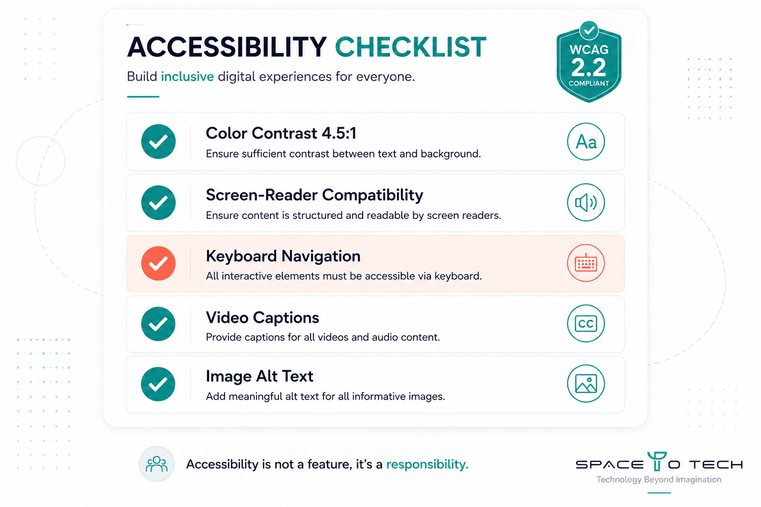
Accessible design means colour contrast ratios that meet WCAG minimums (4.5:1 for normal text at AA level), screen-reader compatibility through proper semantic HTML and ARIA labels, full keyboard navigation so every interactive element is reachable without a mouse, captions on video content, and alternative text on images. Inclusive design - designing for the broadest possible range of users from the start - produces interfaces that are easier to use for everyone, not just users with disabilities.
What Is a UI UX Design System?
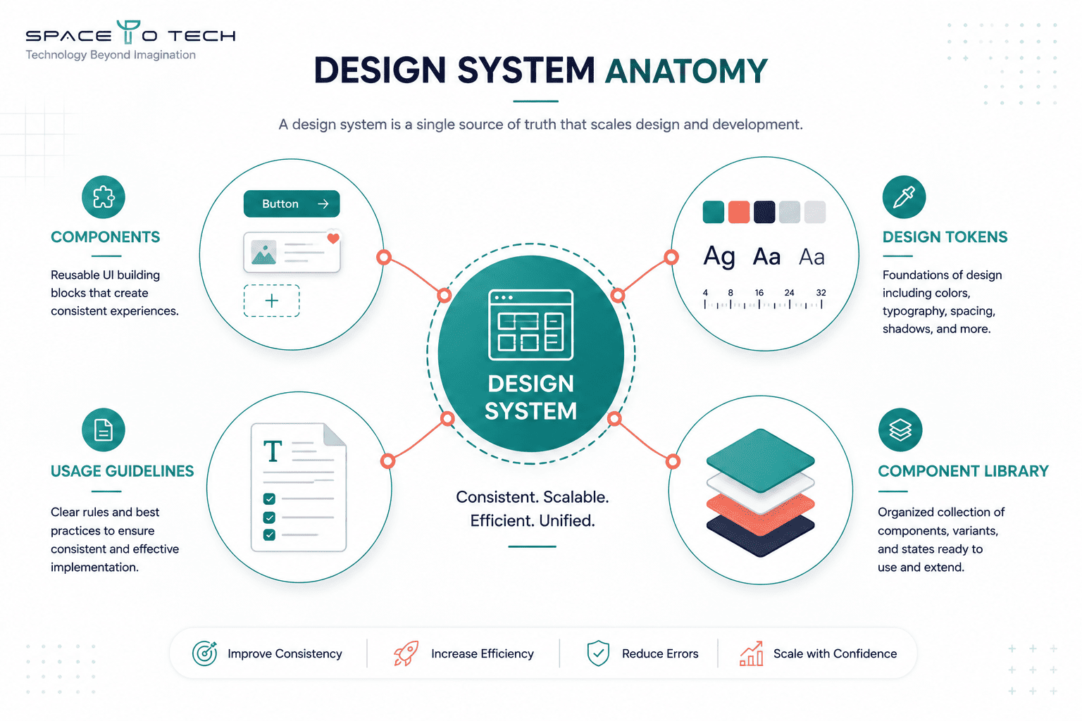
A design system is a documented, reusable set of components, patterns, and standards that define how a product looks and behaves - shared across design and engineering teams.
What a Design System Includes
A design system is not just a style guide or a UI kit. It includes reusable components (buttons, form fields, modals, cards) with documented behaviour and variants, design tokens (the raw values - colours, spacing, typography - that the components are built from), usage guidelines that tell designers and developers when and how to use each component correctly, and a component library that engineers can implement directly.
Why It Matters as a Product Grows
Without a design system, visual consistency degrades as a product scales - different designers make different decisions, developers interpret designs differently, and the product starts to look and feel like it was built by multiple teams with no shared reference point (because it was). With a design system in place, adding new screens and features is faster because the building blocks already exist and are already consistent. Design-related bugs - where something looks different in production than it did in the mockup - become significantly rarer.
UI UX Design for Different Industries
Design priorities shift meaningfully by industry and product type - a one-size approach rarely serves any of them well.
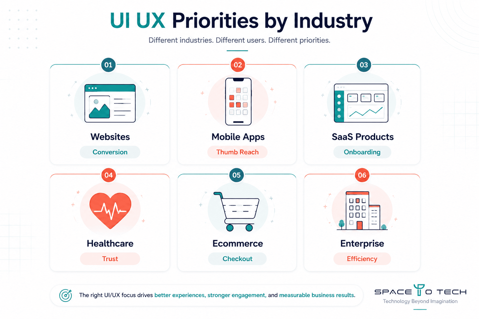
- Websites - The priority is clarity and conversion. Users arrive with a goal (find information, contact, buy, sign up) and leave quickly if the path isn't obvious. Navigation, headline hierarchy, and page load speed are the primary UX concerns.
- Mobile Apps - Thumb reach zones, gesture navigation, and offline states matter in ways that desktop doesn't require. Mobile app UI design has to account for the physical constraints of the device, not just the screen size.
- SaaS Products - Onboarding is the single highest-stakes UX surface. Users who don't reach their first "aha moment" in the early sessions rarely come back. Dashboard design and feature discoverability are the ongoing priorities.
- Healthcare - Trust, clarity, and error prevention take priority over visual flair. Accessibility standards are critical, and the cognitive load on users (often in stressful circumstances) must be minimised. HIPAA implications can affect what data is surfaced and how.
- Ecommerce - Checkout friction is the dominant UX problem. Product discovery, filtering, imagery quality, and trust signals (reviews, return policies, security indicators) all affect whether a browser becomes a buyer.
- Enterprise - Users are forced to use these products, which shifts the design challenge from acquisition to efficiency. Complex workflows, data density, and role-based access need design solutions that a consumer product never requires.
UI UX Deliverables - What You Actually Receive
A design engagement should produce documented, transferable work - not just a Figma file that only the designer who built it can navigate.
- Wireframes - Low-fidelity structural layouts for each core screen, showing content hierarchy and user flow without visual design.
- Prototype - A clickable, interactive simulation of the product used for testing and stakeholder review before development begins.
- Design System - Reusable component library, design tokens, and usage documentation for use across design and engineering.
- Developer Handoff Documentation - Annotated designs with spacing specifications, asset exports, interactive state documentation, and a style guide reference.
Every deliverable should be handed over in a format your team can actually use and update - not locked inside an agency's account.
How AI Is Changing UI UX Design
AI in UI UX has moved quickly from experimental to genuinely useful in the last 18 months - but the change is more nuanced than most coverage suggests.
What AI Tools Can Do Today
AI design tools - including Figma AI features and generative design assistants - can now generate initial layout explorations from a text prompt, auto-populate components into a design structure, suggest colour palettes, and speed up asset creation significantly. This compresses early-stage exploration work that used to take days into hours. AI can also assist with accessibility auditing, copy generation for UI labels and microcopy, and pattern recognition in user research data.
What Still Requires a Human Designer
AI output in design has a consistent weakness: it optimises for pattern, and pattern is not the same as insight. A generative AI tool can produce a checkout flow that looks like every other checkout flow, but it cannot determine whether that flow fits your specific users' mental model, your product's trust posture, or the edge cases your particular business generates. What sometimes gets called "AI-generic" design - competent-looking interfaces that feel templated and interchangeable - is a real risk when AI tools are used without a design thinking layer on top. The judgment about what's actually right for a specific product and a specific user still belongs to a human.
How Much Does UI UX Design Cost?
UI UX design cost for a business project typically runs between $2,000 and $50,000+ depending on scope, platform, and the design partner you choose.
What Affects the Cost
Project complexity is the primary driver - a five-screen MVP and a 40-screen enterprise platform are not comparable projects. Platform scope (website only, mobile only, or both) adds to the work. The depth of UX research required varies significantly: a startup testing a new product hypothesis needs more discovery work than an established business redesigning a known product. Custom design versus template-based design affects cost substantially. Revision cycles and the level of iteration expected also affect final cost.
Pricing by Project Type
| Project Type | Estimated Cost Range | Approx. Timeline |
| Landing Page | $2,000–$5,000 | 1–3 weeks |
| Marketing Website (5–10 pages) | $5,000–$15,000 | 3–6 weeks |
| Mobile App MVP | $8,000–$25,000 | 6–12 weeks |
| Complex SaaS Product | $20,000–$60,000+ | 12–24 weeks |
Pricing by Engagement Type
| Engagement Type | Typical Rate | Best For |
| Freelancer (junior–mid) | $30–$80/hr | Small projects, tight budgets |
| Freelancer (senior) | $80–$150/hr | Specific high-quality work |
| Design Studio / Agency (India) | $25–$60/hr | Full-process, cost-efficient |
| Design Studio / Agency (US/UK) | $100–$200/hr | Premium market, full service |
| In-House Designer | Salary + overhead | Ongoing, high-volume needs |
Our UI UX design services at SpaceToTech operate in the India agency tier - full-process delivery including research, wireframing, UI design, and developer handoff, at rates significantly below US and UK equivalents for comparable quality.
Why Cheap Design Often Costs More Later
Cutting the research and testing stages to reduce upfront cost is one of the most common and most expensive mistakes a business can make. The discovery that a core user flow doesn't work the way you assumed costs a few hours in research. Discovering the same thing three months after launch - because of declining retention, a spike in support tickets, or a failed conversion target - costs a full redesign cycle on top of whatever the original development cost.
How Long Does UI UX Design Take?
UI UX design timelines depend primarily on project scope and how quickly decision-making happens on the client side - slow approvals and frequent scope changes are the two most common sources of timeline extension.
| Project Type | Typical Timeline | What Extends It |
| Landing Page | 1–3 weeks | Multiple revision rounds, unclear brand guidelines |
| Marketing Website | 3–6 weeks | Large page count, content delays, stakeholder disagreement |
| Mobile App MVP | 6–12 weeks | Unclear requirements, integration complexity |
| Complex SaaS Product | 12–24 weeks | Large feature set, multiple user roles, enterprise integrations |
How to Measure Whether Your UI UX Design Is Working
Design quality isn't just a feeling - it's measurable. These are the UX metrics that actually tell you whether a design is performing.
- Task completion rate - What percentage of users successfully complete a key action (sign up, checkout, find information)? A low rate means the flow has a structural problem somewhere.
- Conversion rate - The percentage of visitors who take the desired action. Directly tied to design quality at key decision points in the flow.
- Bounce rate - The percentage of visitors who leave after viewing one page. A high bounce rate on a landing page often signals that the visual hierarchy isn't communicating value clearly enough in the first few seconds.
- User engagement - Time on page, scroll depth, return visits. Engagement metrics tell you whether the product is holding attention beyond the first impression.
Measure these before and after any significant design change - isolated tests produce cleaner learning than wholesale redesigns where multiple variables change at once.
Common UI UX Design Mistakes to Avoid
These aren't generic warnings - they're the specific patterns we see consistently in products that underperform against their potential.
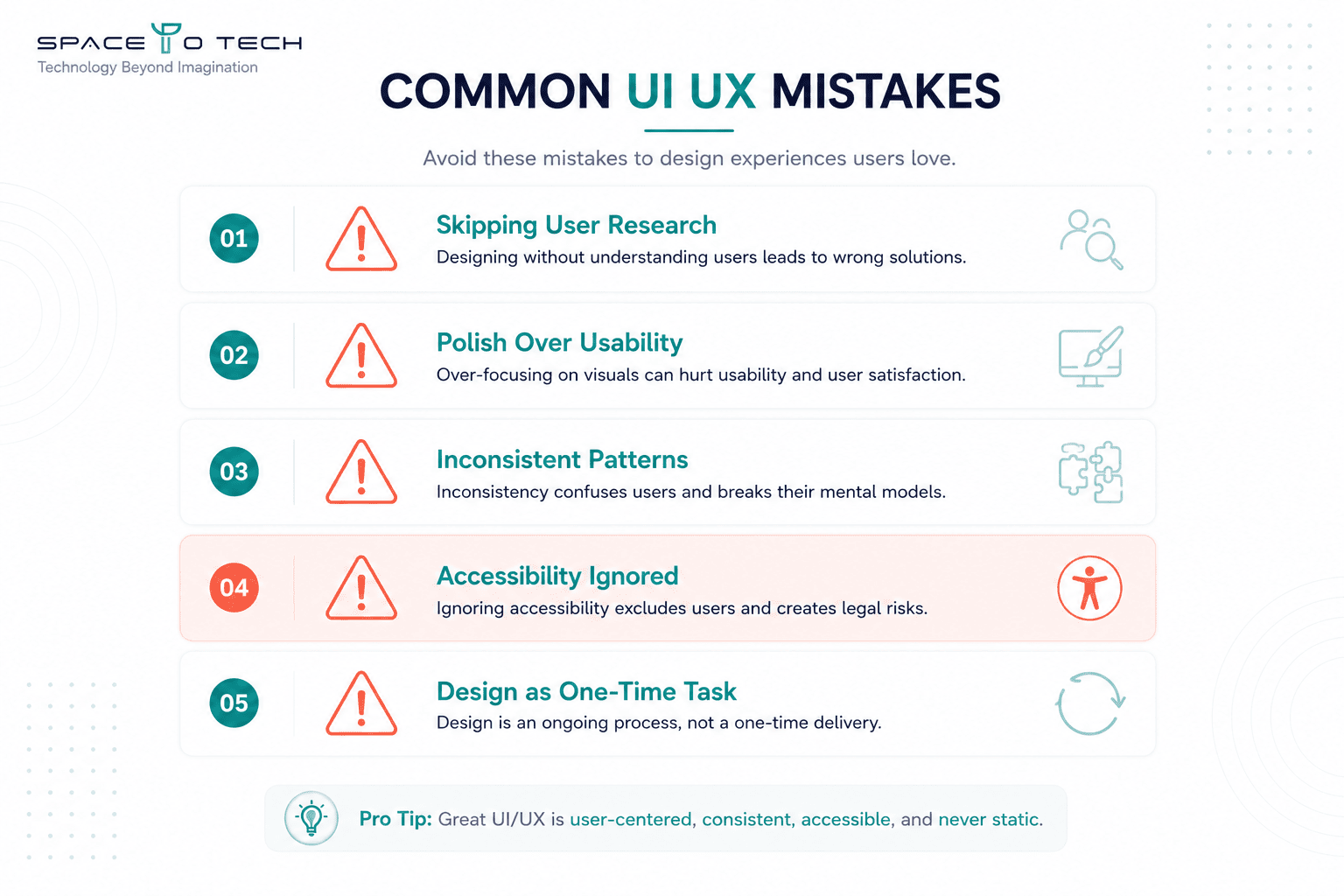
- Skipping user research and designing from internal assumptions. What the product team finds intuitive is not reliable evidence of what real users find intuitive. The gap is almost always bigger than expected, and the consequences show up in retention and conversion data, not in design reviews.
- Prioritising visual polish over usability. A beautiful interface that confuses users fails commercially, even if it looks good in a portfolio screenshot. Visual design should serve usability, not compete with it.
- Inconsistent design patterns across screens. When buttons look different on different screens, or the same interaction works differently in different parts of the product, users lose confidence. Inconsistency reads as unfinished, even when everything technically works.
- Ignoring accessibility until after launch. Retrofitting accessibility into a product that was designed without it is significantly more expensive and time-consuming than building it in from the start. It also exposes the business to legal risk in the interim period.
- Treating design as a one-time task rather than an ongoing process. Products evolve, user behaviour changes, and markets shift. Design that isn't revisited and tested regularly becomes stale - and stale design quietly erodes the metrics that matter.
Hire UI UX Designers - Engagement Models and What to Expect
Knowing you need a UI UX designer is one thing. Knowing which hiring model actually fits your project is where most businesses lose time and money before design even starts.
Dedicated UI UX Designer
A dedicated designer works exclusively on your product - embedded in your team, attending your standups, making decisions in context rather than in isolation from a project brief. This model works best when the design scope is ongoing rather than project-defined: a SaaS product adding features continuously, an internal tool being built iteratively, or a startup that wants design judgment available week to week rather than delivered in a single package. The advantage is continuity - the designer understands the product's history, constraints, and user feedback as it accumulates, rather than re-onboarding every engagement. SpaceToTech offers dedicated designer placement at India-based rates, which gives you senior-level design thinking at a fraction of what a permanent in-house hire in the US or UK costs.
Project-Based Engagement
A project-based engagement has a defined start, defined scope, and defined deliverables - research, wireframes, UI design, prototype, developer handoff. This is the right model for a new product launch, a redesign of a specific part of an existing product, or a one-time engagement to establish a design system and visual language. You know what you're getting and what it costs before work begins. At SpaceToTech, a typical project-based engagement kicks off with a one-to-two week discovery phase before any screen design starts - the brief, the user research plan, and the success metrics are agreed in writing before the design work begins.
Team Augmentation
Your existing engineering or product team has momentum but a specific design gap - nobody in-house with UX research skills, a visual designer who can produce components but hasn't built a full design system before, or frontend engineering capacity that's outrunning the design resource. Team augmentation means a UI UX designer from SpaceToTech slots into your existing process, your existing tools, and your existing sprint cycle. No ramp-up overhead beyond a single onboarding call. No project handover risk.
What to Evaluate Before You Hire
When evaluating any design resource - whether a dedicated hire, a project studio, or an augmentation placement - the questions that actually matter: Can they show you work in a product category similar to yours, and can they explain the design decisions they made and why? Do they have a documented process that distinguishes UX research from UI design, or does "design" mean they open Figma and start making things look nice? How do they handle disagreement when research findings conflict with stakeholder preferences? And what does their handoff to development look like - is it a Figma file link, or is it annotated, documented, and built to survive contact with an engineer who wasn't in any of the design conversations?
SpaceToTech's UI UX design services cover all three engagement models - dedicated designer, full project delivery, and team augmentation - with onboarding typically taking one to two weeks from initial conversation to first sprint.
How to Choose a UI UX Design Company
The right UI UX design company for your project is the one with demonstrated experience in your type of product and a process that's transparent enough for you to actually understand what you're buying.
Portfolio Relevance
Don't just look for work that looks good - look for work in your product category. A studio with beautiful consumer brand identity work is not automatically the right choice for a complex B2B SaaS product. Ask specifically what problem each portfolio piece was solving, what constraints the team was working under, and what the measurable outcome was after launch. Portfolio work that can't be explained in those terms is decoration, not evidence.
Process Transparency
Any design partner worth hiring has a documented, explainable process - and can tell you, at the start of an engagement, what will be delivered at each stage and what decisions you'll be asked to make. Red flags: vague "we work collaboratively" language without specifics, no mention of research or testing in their process description, and pricing that can't be broken down by stage.
Communication Cadence and Post-Launch Support
Design doesn't end at developer handoff. A good design partner defines what post-launch support looks like before the engagement starts - is there a review after the first month of live usage? What happens when a usability problem is discovered post-launch that wasn't caught in testing? How are ongoing iterations handled?
When you hire UI UX designers, the quality of the working relationship - specifically how often and how clearly they communicate - matters almost as much as the design output itself. Projects that go sideways almost always have a communication breakdown somewhere in the chain.
Future of UI UX - Trends to Watch
AI has its own section earlier in this guide - these are the shifts beyond it worth tracking.
Voice and Conversational UI - As voice interfaces and AI-driven chat become more embedded in products, UX design is being asked to design conversations, not just screens. The principles are different, the testing is different, and the failure modes are different. This is still early for most business products, but the trajectory is clear.
Hyper-personalisation - Products are increasingly expected to adapt to individual user behaviour in real time - serving different content, different flows, and different recommendations to different users based on their context and history. The design challenge is building systems that personalise without feeling invasive, and that degrade gracefully when personalisation data is incomplete.
Accessibility-by-Default - As legal requirements increase across markets, accessibility is shifting from a retrofit consideration to a starting-point requirement. Design systems built with accessibility baked in from component level are becoming the standard, not the exception, for any product that intends to operate across multiple markets.
Ready to Improve Your Product's UI UX?
Whether you're designing a product from scratch, redesigning something that's underperforming, or adding a design layer to a product that was built without one - the right starting point is a conversation about what you're actually trying to achieve and what the user journey looks like today.